The allure of high-seas adventure isn't just about gold—it's about the tangible texture of exploration. When designing the interface for Pirates Plunder, our artistic crew focused heavily on tactile realism. We wanted players to practically smell the brine-soaked timbers of their vessels.
1. The Visual Hierarchy of Plunder
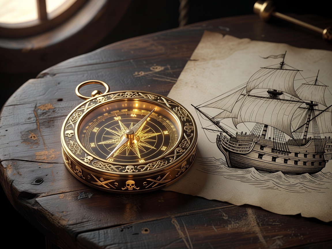
Classic ocean myths rely on high-contrast iconography. Weathered iron anchors provide visual stability, while vibrant, polished gold doubloons introduce high-energy highlights. By utilizing a deep navy background (--color-bg-deep: #060e1a), we allow the primary gold gradients (#ffe066 to #ff9900) to glow dynamically without straining the eyes during midnight voyages.
2. Tactile Audio and Physical Weight
True immersion is achieved when digital actions have weight. Every spin in our sandbox feels mechanical. Soundscapes of heavy iron gears turning, wooden wheels creaking, and waves slapping the hull are synched perfectly with CSS keyframes. The final result is a virtual playground that delivers satisfaction through pure craftsmanship, proving that real amusement comes from sensory depth rather than financial risk.
"The secret to rich pirate themed design is ensuring that every click sounds like heavy metal, and every triumph looks like a sunset over the Caribbean."
3. Engaging the Next Wave of Adventurers
By blending modern flat-design principles with classic oil-painting textures, Smilejourneyex delivers a hybrid look that feels both historic and ultra-modern. We will continue to expand our design logs, bringing you more hand-painted UI symbols and responsive canvas behaviors in our upcoming releases.